By clicking “Accept”, you agree to the storing of cookies on your device to enhance site navigation, analyze site usage, and assist in our marketing efforts. View our Privacy Policy for more information.
Discovering Complete Nutrition with Soylent
Founded in 2013, Soylent offers a number of meal-replacement drinks, powders, and bars to help people eat healthy and sustainably even when they don't have the extra time.
Barrel teamed up with Soylent to redesign and optimize key moments of their site with the focus to increase subscriptions, better highlight product benefits, and ensure clear pathways across the site, all while extending the brand system.

With subscriptions being top of mind, one of the first things that was redesigned was the product cards that live on the PLP, Homepage, etc. By developing a "quick add" feature to the cards we were able to not only alert people to the ability to subscribe, but gave users the ability to subscribe from anywhere at anytime. We carried this mentality into the rest of the design throughout the Homepage and PLP, making sure that information was not only immediate, but digestible.
When it came to the PDP, it was critical to make sure that not only the nutritional benefits of Soylent came through, but the flavor profiles were highlighted in a unique and branded way. By utilizing bold strips of color, action shots of the various flavors and their ingredients, and a robust visual ingredients list we were able to strike the balance between education and a unique visual experience.

Check out the site here
Posted on
August 31, 2021
Interested in collaborating on a project?
Get StartedLatest Updates
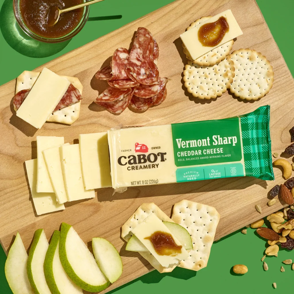
Cabot Evolves Its Site Experience with Enhanced Search
News

Observations from Expo West 2026
Insights
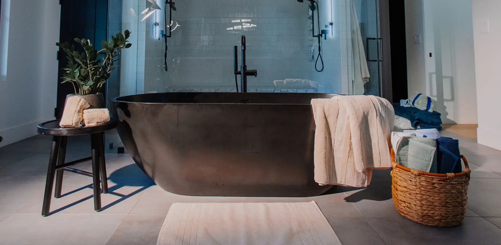
Driving Product Discovery with New Marketing Pages for Wamsutta
News

Anthony’s Goods Expands into Retail with Erewhon Partnership
News

Growing With Khloud, One Flavor at a Time
News

How User Testing Shaped Revision Skincare’s Digital Experience
News
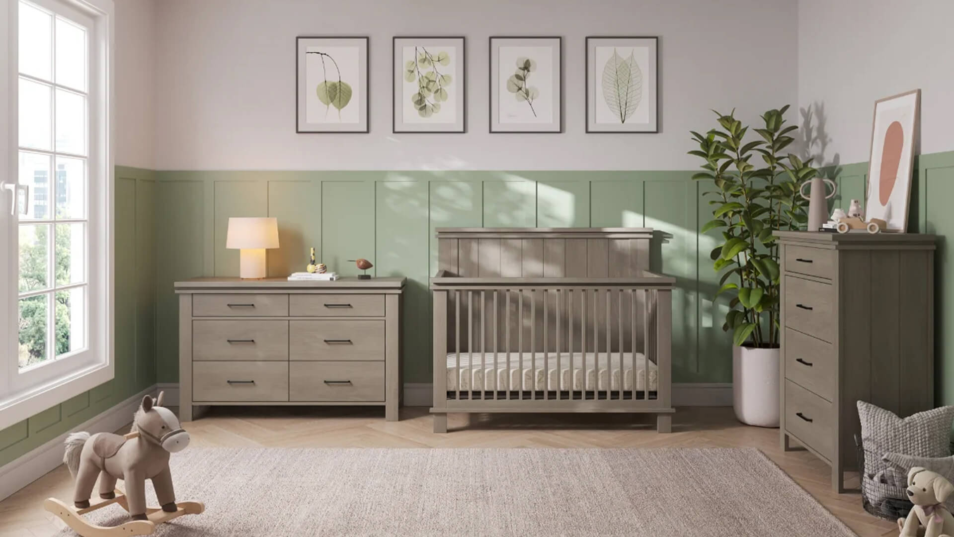
Helping HALO Scale Its Digital Ecosystem Through the Child Craft Acquisition
News
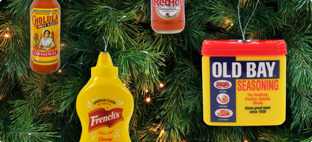
Bringing a Cohesive Holiday Experience to the McCormick Shop
News


